Case Study · Senior Capstone, Spring 2022

MultiVs — a single home for fragmented gaming knowledge.

A centralized resource platform for competitive and casual gamers — character data, game mechanics, and community guides in one place. Built with a four-person team using the Goal-Directed Design framework. I led user research synthesis, designed the high-fidelity Game Library, Character pages, Community Guides, and Settings sections, and ran usability testing across two iteration cycles.

Role
UX Research Lead
UI Designer
Timeline
Spring 2022
4 months
Team
4 designers
Tools
Figma, Miro
[ Game Library — exported Figma frame ]
Game Library — the entry point into MultiVs.
01 / Research

Establishing who we were designing for.

Rather than relying on assumptions, we conducted user interviews with both competitive and casual players, a competitive audit of existing gaming wikis, a literature review on how players learn and retain game mechanics, and affinity mapping to synthesize findings. I led the audit and conducted several of the user interviews. The synthesis surfaced something counterintuitive:

Key Finding

Users reported being satisfied with existing resources — but follow-up questions revealed this satisfaction wasn't earned. They were tolerating poor tools because reliable alternatives didn't exist.

The bar wasn't "this works well," it was "this works at all."

[ competitive audit matrix ]
Competitive audit comparing existing resources across operating system, features, visual design, and user reception.
02 / Modeling

Translating patterns
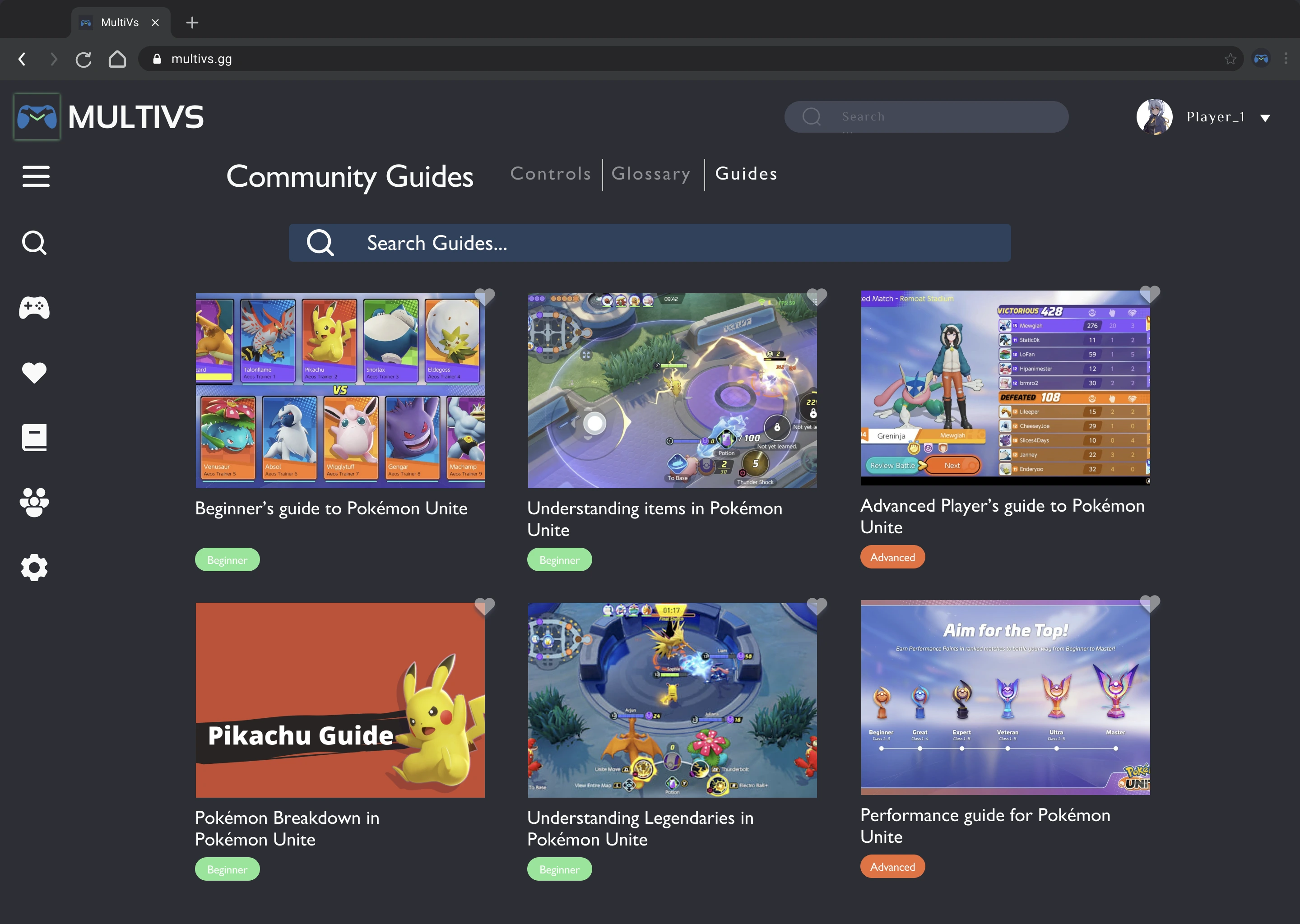
 into people.

With our research synthesized, two distinct user behaviors emerged: players seeking quick reference to data they'd already learned (frame data, item builds, matchup info), and players seeking onboarding into systems they didn't yet understand. These became Hector and Arlie.

Hector emerged directly from interview patterns. KSU's Marietta campus — formerly Southern Polytechnic — has a significant engineering and CS student population that overlapped strongly with competitive gaming engagement. Local FGC participants, League players, and one internationally-competing player surfaced consistent themes: reliance on stat trackers, preference for quick-reference formats over long-form content, and frustration that in-game information was insufficient for serious learning.

Arlie was a more deliberate construction. Goal-Directed Design pairs personas to surface tensions, and Hector alone would have over-indexed the design toward power users. Looking back, her construction relied more on reasonable assumption than direct interview synthesis — with more time, I'd have weighted research toward casual players to validate or revise her needs profile.

The end product needed to serve both without compromising either: depth without overwhelm, accessibility without condescension.

H
Hector
Primary · Mid-to-late 20s · Software engineer · Casual esports competitor

Behavior: Knows what he's looking for and needs to get there fast. Uses external resources because in-game information is insufficient.

Needs
  • Quick, easy access to information
  • Easy access to saved information
  • Intuitive search
  • Information that's easily understandable
  • The community aspect
Obstacles
  • Information isn't centralized
  • Information not well presented or documented
  • Most character info lives in unmoderated, gatekept Discords
Wants
  • Technical descriptions
  • Player analytics tracking
  • Minimalist layout, minimal distractions
  • Information separated by skill level
A
Arlie
Secondary · 20s · University student · Casual gamer

Behavior: Doesn't yet know what she doesn't know. Looking for an onramp into systems she hasn't learned.

Needs
  • Well organized information
  • Comprehensive info in video or info-graphics
  • Good onboarding process
  • Good navigation
Obstacles
  • Information is disorganized and not always trustworthy
  • Doesn't know which resources to use — doesn't know how much she doesn't know
Wants
  • Visually appealing interface
  • Comprehensive graphics paired with information
  • Background information
Note on the artifact: The original persona document leaned on demographic framing — gendered photos, urban/rural labels, relationship status — that 2022-era persona conventions encouraged but that didn't earn its place analytically. The redesigned cards above keep what's actually research-derived (age range, occupation, behavioral category, and the Needs / Obstacles / Wants synthesis) and drop what wasn't.
03 / Frameworks & Refinement

From v1 to v2, in service of clarity.

Initial wireframes (v1) established the core architecture and screen flows. After preliminary review and early feedback, I iterated to v2 — tightening flow logic, regrouping related screens, and clarifying navigation paths. The information hierarchy and iconography established here carried forward into high-fidelity.

Wireframe v1Initial flow
[ wireframe v1 ]
Wireframe v2Iterated flow
[ wireframe v2 ]
Iteration focused on grouping related screens (Settings, Profile, Login), clarifying flow between Character and Item views, and tightening navigation rail logic.
04 / High-Fidelity

Realistic content, not lorem ipsum.

The high-fidelity prototype was built in Figma. I designed the Game Library, Character pages, Community Guides, and Settings sections — populated with realistic content to give testers an authentic feel rather than lorem ipsum scaffolding. Visual language emphasized dark mode for extended use, with iconography drawing from established gaming UI conventions.

[ Game Library — hi-fi ]
Screen 01

Game Library

The entry point — a visual-forward grid layout addressing Arlie's need for browsable discovery, with favoriting and search supporting Hector's targeted access.

Hector · targeted access Arlie · browsable discovery
[ Character page — hi-fi ]
Screen 02

Character Page

The core feature — character data laid out for scannability. Stats grid, role tags, and ability cards are organized so Hector can confirm matchup info in seconds, while ability descriptions remain accessible enough to support Arlie's onboarding.

Hector · scannable stats Arlie · readable abilities
[ Community Guides — hi-fi ]
Screen 03

Community Guides

Content tagged by skill level (Beginner / Advanced) directly addresses Arlie's need to identify what she didn't know — without forcing Hector to wade through introductory material.

Arlie · learn what you don't know Hector · skip the basics
05 / Reflection

What worked, what didn't.

Final usability testing surfaced a positive response to the overall layout and information hierarchy, with consistent friction around iconography in the navigation rail. Testers responded well to the efficient layout and the project's premise as a centralized resource. With more iteration time, the next priority would have been an icon labeling system or hover-state treatment to reduce learning curve.

Goal-Directed Design's emphasis on personas and user flows kept the work grounded — every design decision traced back to either Hector's need for depth or Arlie's need for accessibility. If I were to approach this again, I'd allocate more time for usability testing in the high-fidelity phase. The iconography confusion that surfaced late could have been caught earlier with more iteration cycles, particularly around the navigation rail.

Explore the MultiVs prototype.

Interactive Figma prototype · Spring 2022
Open prototype