WordBubble was an academic Lean UX project to design a note-taking app that bridges physical and digital workflows: scan handwritten notes, convert them to editable digital text, and organize them inside a unified planner. Conducted during the COVID-19 pandemic with limited participant access, the project followed a rapid sprint-based process, testing assumptions early and iterating from real feedback at every step. The result is a scanner, note editor, and planner combined into one system, designed to replace the Evernote + Google Keep + Adobe Scan juggling act.
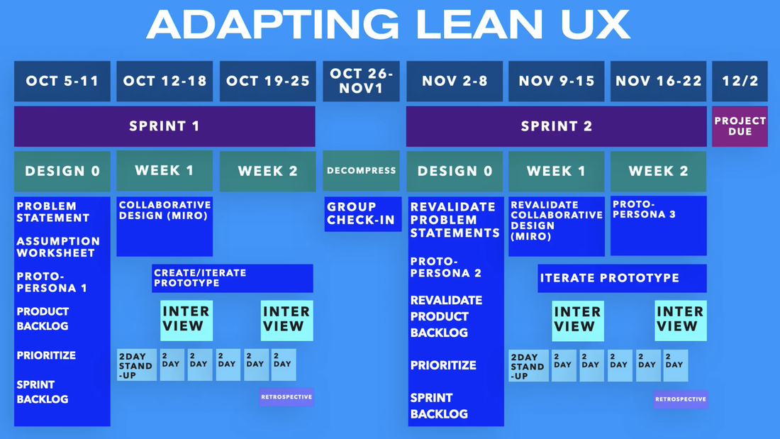
The project ran as two three-week sprints with a decompression week between them, executed entirely remotely — the team collaborated over Discord, Figma, and Miro through the height of the pandemic. Each sprint opened with a "Zero" week for framing assumptions, moved through design and MVP build, and closed with two rounds of user research that fed the next round. With a limited participant pool, the discipline of "test small, learn fast" was less a method than a necessity.
01
Assumptions
→
02
Design
→
03
Build MVP
→
04
Research
↺
The rest of this page will walk through this loop twice. a full first for Sprint 1, when the whole product was still an open question, then a lighter second pass for Sprint 2, when the skeleton was already standing and the work was tuning it against what we'd learned. The stepper under each heading marks where in the loop we were.
Shown: the course's actual cadence - two sprints, a decompression week between, and interview rounds accompanying each design-and-build cycle.
What we believed going in
Sprint 1
01Assumptions
→
02Design
→
03Build MVP
→
04Research
↺
During "Week 0", we pooled informal field research from our student peers, audited the note-taking apps people already used, sketched two proto-personas, and wrote our beliefs down as testable "we believe…" statements. Everything here was speculation - the point of the sprint was to find out which of our assumptions were wrong.
The problem statement
The current state of scanning & note taking apps have focused primarily on creating solely digital fields and scanning high-resolution replicas. What existing products / services fail to address is the transcribing elements and addressing physical notes, and our proposed service will address this gap by creating an app that transcribes editable versions of physical notes. Our initial focus will be streamlining the physical to digital conversion of notes.
Sprint 1 · problem statement
Competitive audit
A feature audit of the four most-mentioned alternatives confirmed the fragmentation our peers described. Each existing tool handled partof the workflow well. Evernote for organization, Adobe Scan for transcription - but none handled the loop end-to-end. WordBubbl was scoped to fill that gap.
Feature
Evernote
Google Keep
Adobe Scan
Text Scanner
WordBubbl
Transcribe scanned images to text
✕
✕
✓
✓
✓
Native calendar / planner
✕
✕
✕
✕
✓
Note-taking
✓
✓
✕
✕
✓
Notifications
✓
✓
✕
✕
✓
Organize notes in folders
✓
✕
✕
✕
✓
Proto-personas
Two proto-personas anchored the early design. Cole represented the disorganized-but-determined student who needs the system to bend around the chaos of college life. Jole represented the time-pressed educator who needs reliability and clarity above all else. Together they bracketed the audience: one user who'd forgive friction in exchange for power, and one who wouldn't.
C
Cole
Primary · College student · Disorganized but determined
Behavior: Generates a lot of notes across formats — handwritten in class, digital at home — and routinely loses track of which exists where.
Needs
Organize an abundance of notes across multiple formats
Behavior: Manages multiple class schedules and a constant flow of paperwork. Not tech-savvy by default, but willing to learn if the payoff is clear.
Needs
Maintain multiple schedules in one place
Quickly access and edit notes
Desires
Provide clear class schedules
Keep track of multiple classes
Obstacles
High-stress, fast-paced environment
Frequently misplaces notes
Limited free time to learn new tools
Note on the artifact: The original persona document leaned on stock-photo portraits and demographic chips (relationships, partner details) that we'd construct differently today. The redesigned cards above keep what's actually research-derived — behavioral category and the Needs / Desires / Obstacles synthesis — and drop the rest. (Jole's fate gets decided in Sprint 2.)
Ideal outcomes → sprint backlog
From a longer list of hoped-for outcomes we prioritized four into the sprint backlog, each written as a falsifiable assumption tied to a specific user (Cole) and a specific outcome. These would drive every design decision that followed.
We believe we can increase user engagement with WordBubbl if Cole becomes more efficient through access to an app with good UI.
We believe we can grow our user base if Cole becomes more efficient at work by having persistent access to his notes.
We believe we can increase user retention if Cole becomes more efficient at managing his schedule using note-organizing features.
We believe we can earn positive app-store reviews if Cole is happier using an accessible app that accommodates the diversely-abled.
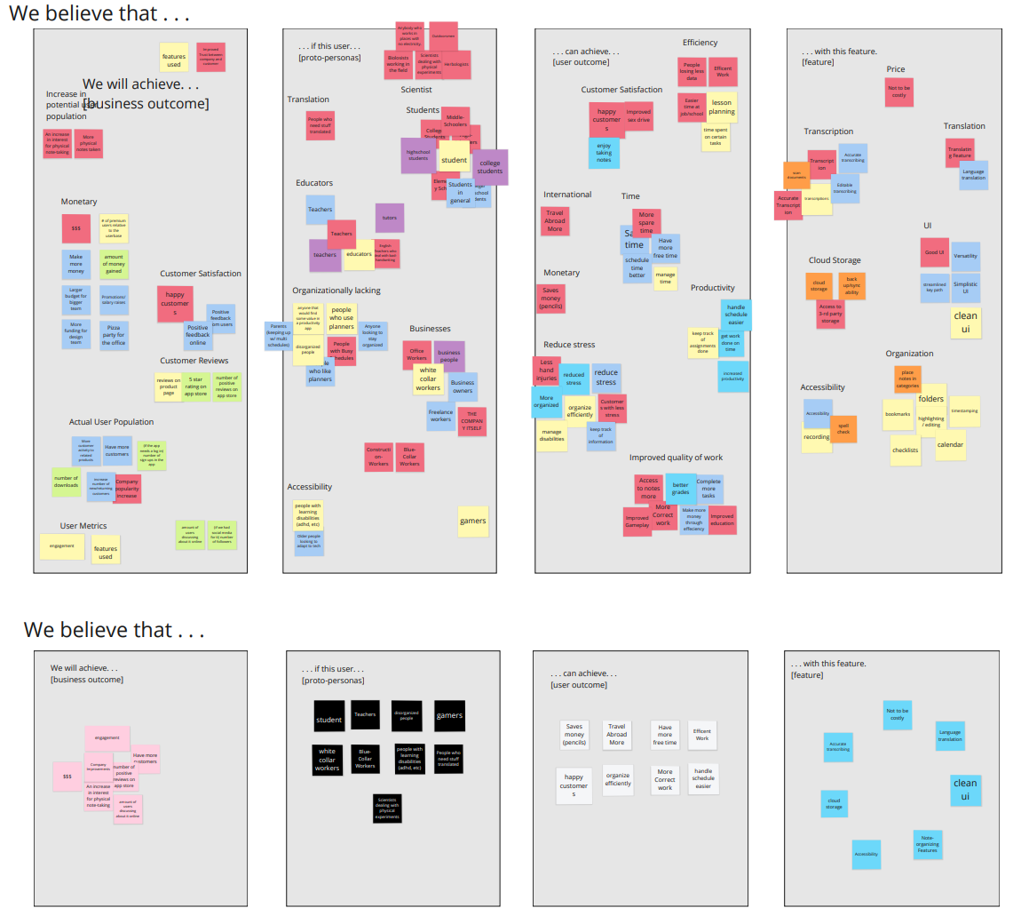
These statements didn't arrive fully formed, so we mapped every assumption across four columns - the business outcome we wanted, the proto-persona who'd get us there, the user outcome they were after, and the features that would deliver all of the above - then clustered and distilled the sprawl down to the handful that was both achievable in our timeframe and worth testing.
Assumption map — the full "we believe that…" board (top) distilled to the prioritized bets that became the sprint backlog (bottom).
Wireframing
Sprint 1
01Assumptions
→
02Design
→
03Build MVP
→
04Research
↺
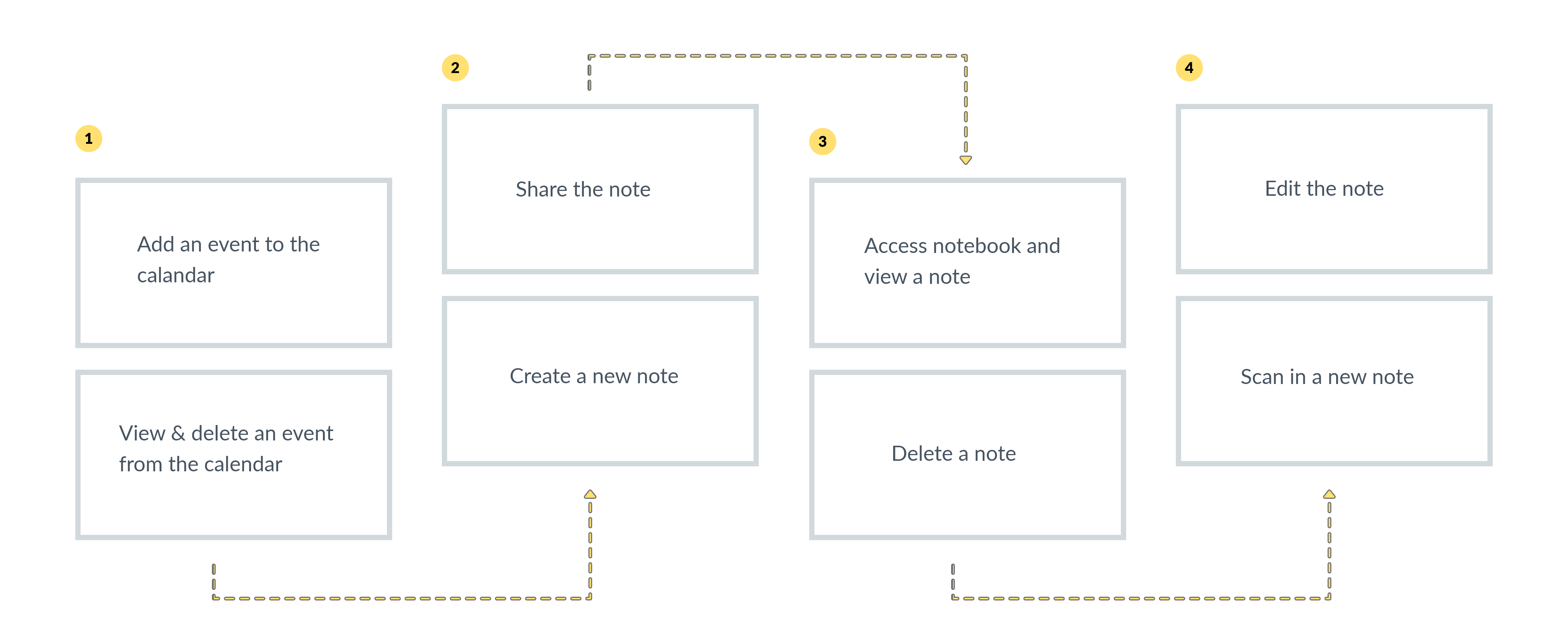
Each teammate took one surface - home, planner, notes, camera - and wireframed it straight from the assumptions. We then stitched the pieces into a single navigable paper map, so a tester could attempt a real task end-to-end before we'd built anything clickable. Locking the navigation down on paper made every phase that followed cheaper.
The user flow — six screens and two branching paths from the home dashboard, assembled from each teammate's section into one navigable map.
The first Figma prototype
Sprint 1
01Assumptions
→
02Design
→
03Build MVP
→
04Research
↺
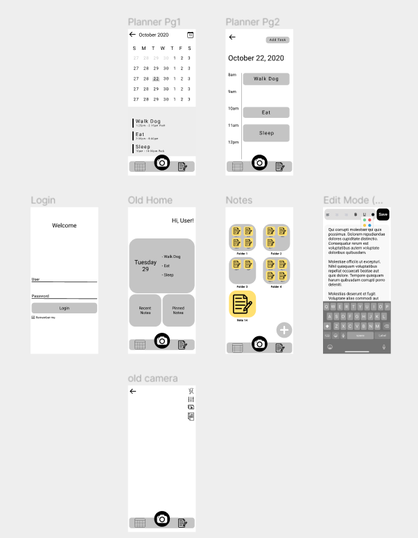
The paper map became a Figma prototype — the minimum viable skeleton. Rough, mostly monochrome, and just interactive enough to hand to a participant and watch them navigate. Building it out was my responsibility, along with wiring every screen together so a testing session could run without a facilitator driving the taps.
Sprint 1 MVP included a login, home, planner, notes, editor, and camera.
What testing taught us
Sprint 1
01Assumptions
→
02Design
→
03Build MVP
→
04Research
↺
Each sprint carried two rounds of research. Every interview opened with questions about participants' real organization, planning, and note-taking habits; then we walked them through the prototype and asked them to complete a pre-set list of tasks while we logged where specific pain points were. Afterward, each session was synthesized into an affinity map where we could identify common points to address. The pandemic capped our participant pool, so we re-interviewed several of the same students and educators across rounds.
Key Finding
Participants weren't choosing paper because they hadn't found a good digital tool, but because the tactile experience of handwriting mattered for thinking. Digital notes were valued for what comes after: access, integrity, and availability.
What we heard
Finding 01
Analog for thinking, digital for keeping
People reached for paper in the moment of capture, then wished for a searchable, organized copy later. The value wasn't in replacing the page — it was in what happened after it.
“I take notes on paper, but I always lose them before finals.”Student · Sprint 1
Finding 02
One workflow, too many apps
Getting from a physical page to an organized digital note meant hopping between a scanner, an editor, and a storage app.
“I have to juggle so many different apps that I usually just default to my notes app.”Student · Sprint 1
Finding 03
Warmth reads as trustworthy
Sterile, utilitarian interfaces felt like work. Testers gravitated toward a softer, paper-like aesthetic — it lowered the barrier to actually opening the app and writing.
“I would use Evernote, but it's so flat it's almost depressing to look at.”Student · Sprint 1
Early navigation confused everyone
Across both rounds, the clearest usability signal was navigational: the bottom toolbar competed with page content and left users unsure how to get home. This was a product of our attempt to make use of the familiar mobile form factor, but testing would reveal that an adherence to this on the basis of familiarity alone didn't justify its presence in an app that would, by it's nature, derive value from maximizing screen space and simplifying navigation.
The pivot
Sprint 2
↺
01Assumptions
→
02Design
→
03Build MVP
→
04Research
Sprint 2 opened similarly to the way Spring 1 did - by revalidating the assumptions against what we'd actually learned. Most held, but two didn't.
Revised problem statement
We found the idea of a note-taking application to be somewhat narrow in scope in the wake of what we discovered about our users, which meant that our previously established minimum viable product would no longer satisfy their needs. In light of this, we changed the focus to the development of an all-purpose and easy to use planner with note taking functions.
We also revised the personas to better align with our problem statement and our expected user needs. Later, with such a narrow, pandemic-limited participant pool, we couldn't recruit or interview anyone who represented Jole, the secondary teacher persona = so rather than keep validating an assumption we had no data for and an identity that wasn't distinct enough for our other persona, we would mostly consolidate Jole's user needs into Cole. Another assumption, but justified by the already existing parallels between the two. Sharper, evidence-backed hypotheses replaced the ones the first round had disproved, and those became the Sprint 2 backlog.
Fixing navigation
Sprint 2
01Assumptions
→
02Design
→
03Build MVP
→
04Research
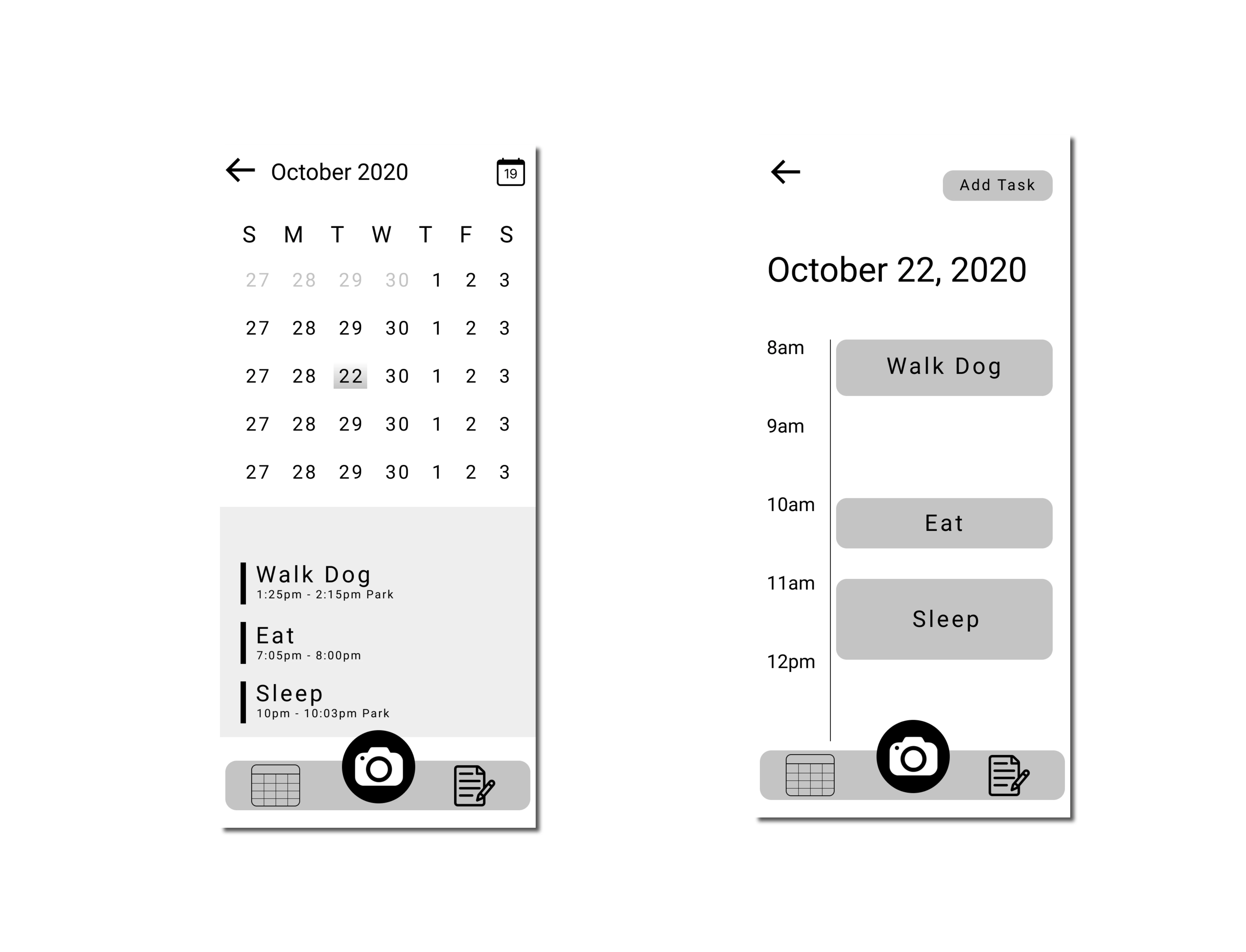
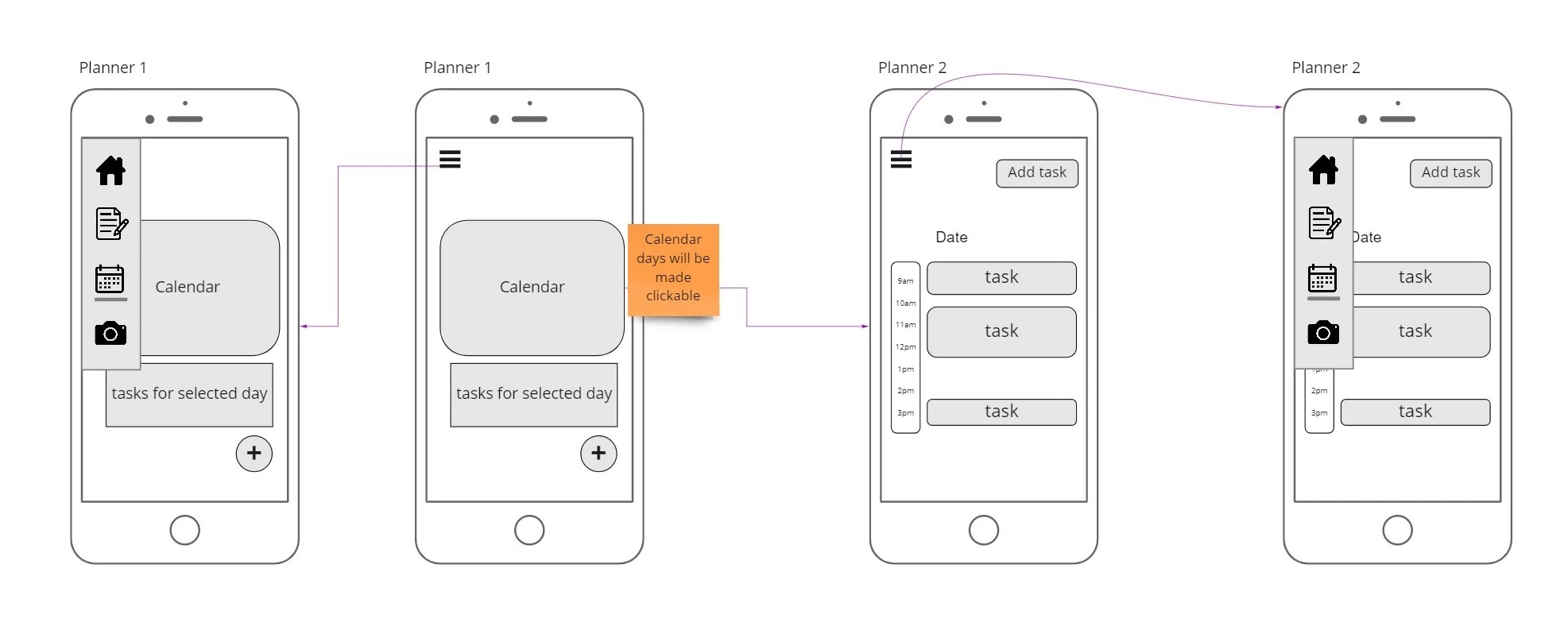
The navigation finding drove the clearest design change. The first wireframes had the planner floating on its own with a bottom toolbar that competed with content; round two removed the toolbar, added an unobtrusive hamburger menu, made calendar days explicitly tap-able, and tightened the hierarchy between the date picker and the task list.
v1Initial
v2Revised
v1 → v2 — added the hamburger menu (returning users to home), made calendar days clickable, and clarified the date-to-task relationship.
The final build
Sprint 2
01Assumptions
→
02Design
→
03Build MVP
→
04Research
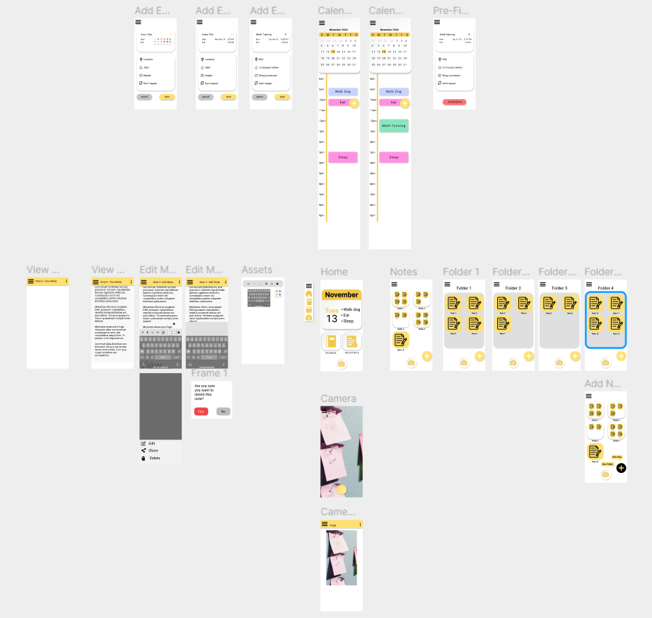
By Sprint 2 the frame was already standing, so building and testing happened at the same time. With a nearly-finished product it was easy to tune small issues live as interviews surfaced them. The visual language pulled straight from the legal pad: warm yellow as the primary, neutral greys for structure, soft drop shadows to make tap-able surfaces feel like physical objects. The goal was to make a digital note feel less sterile.
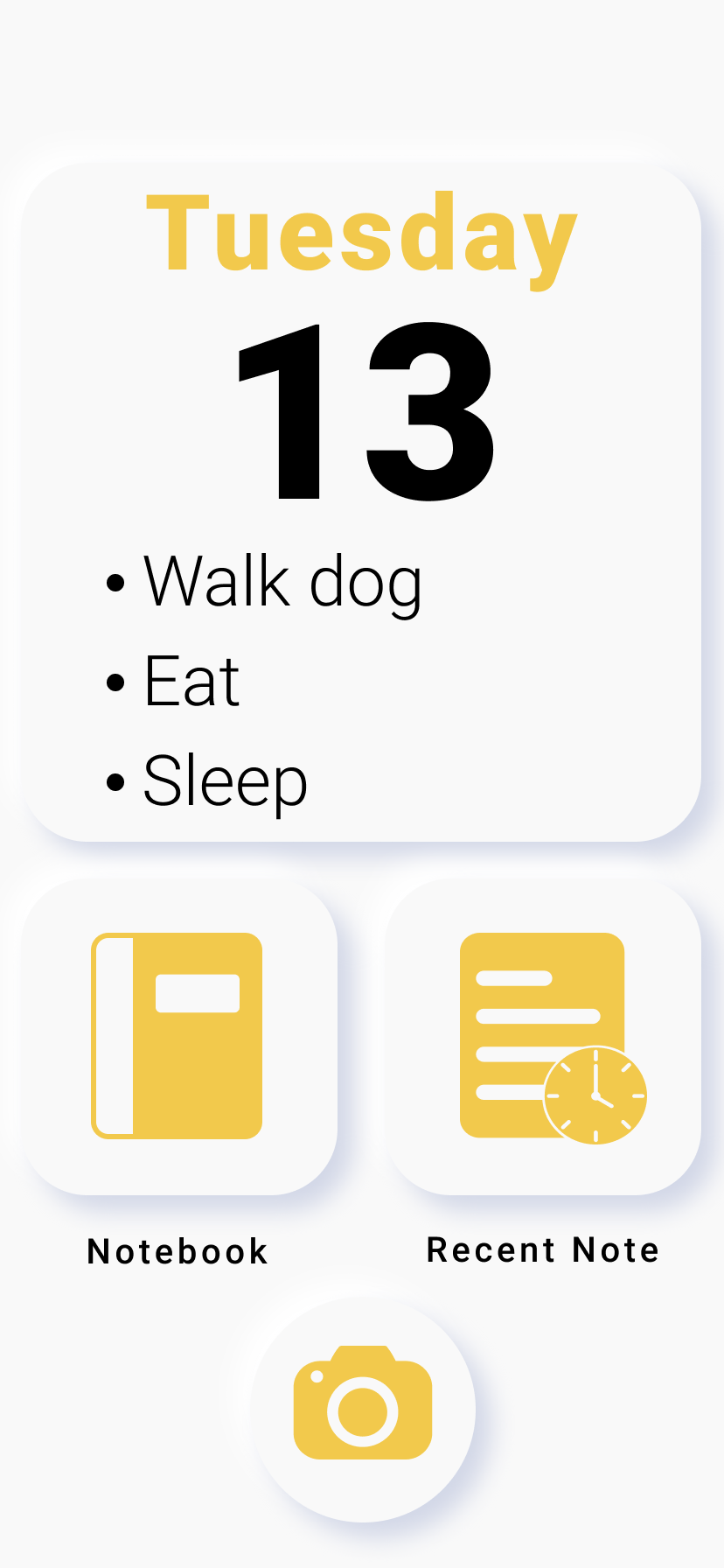
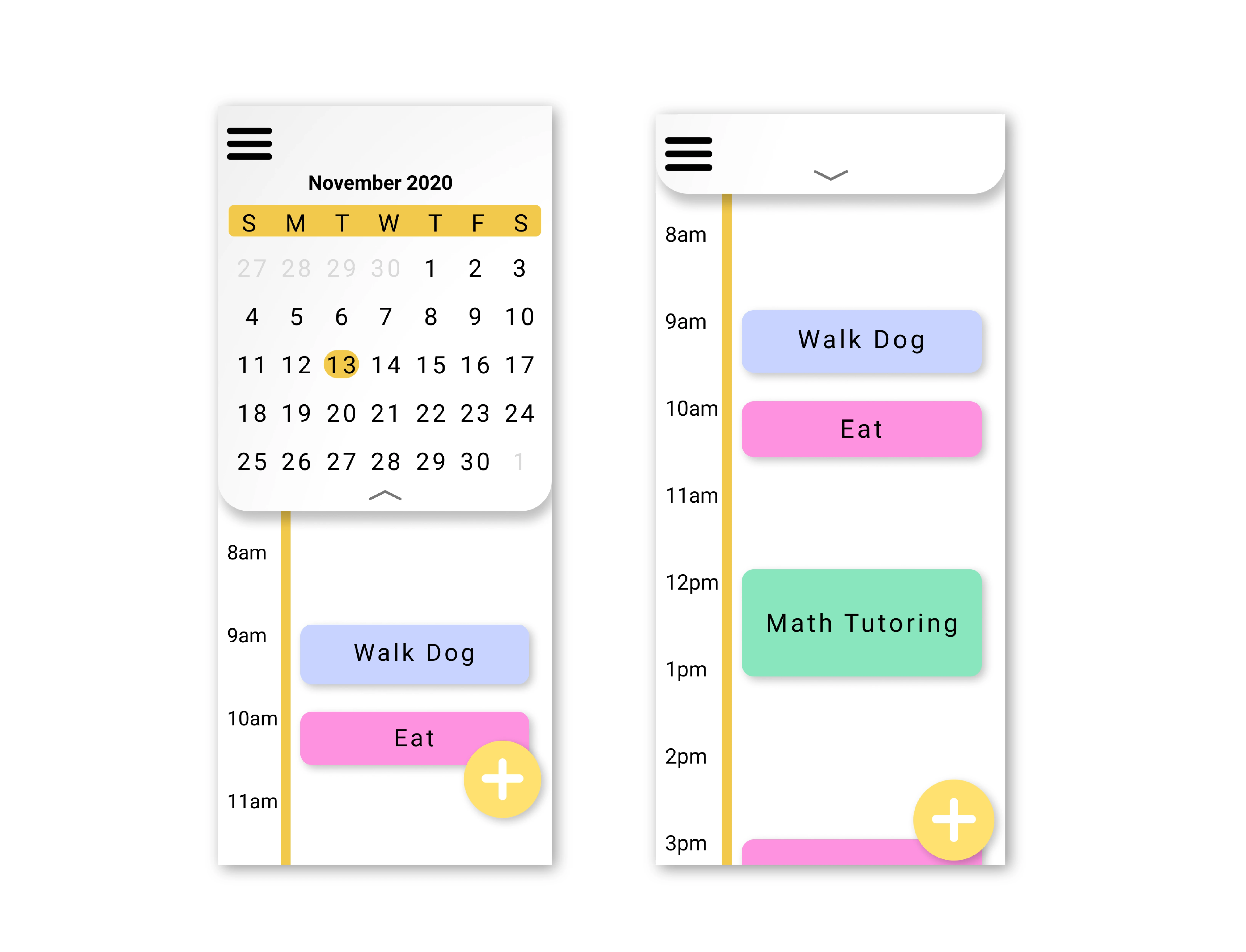
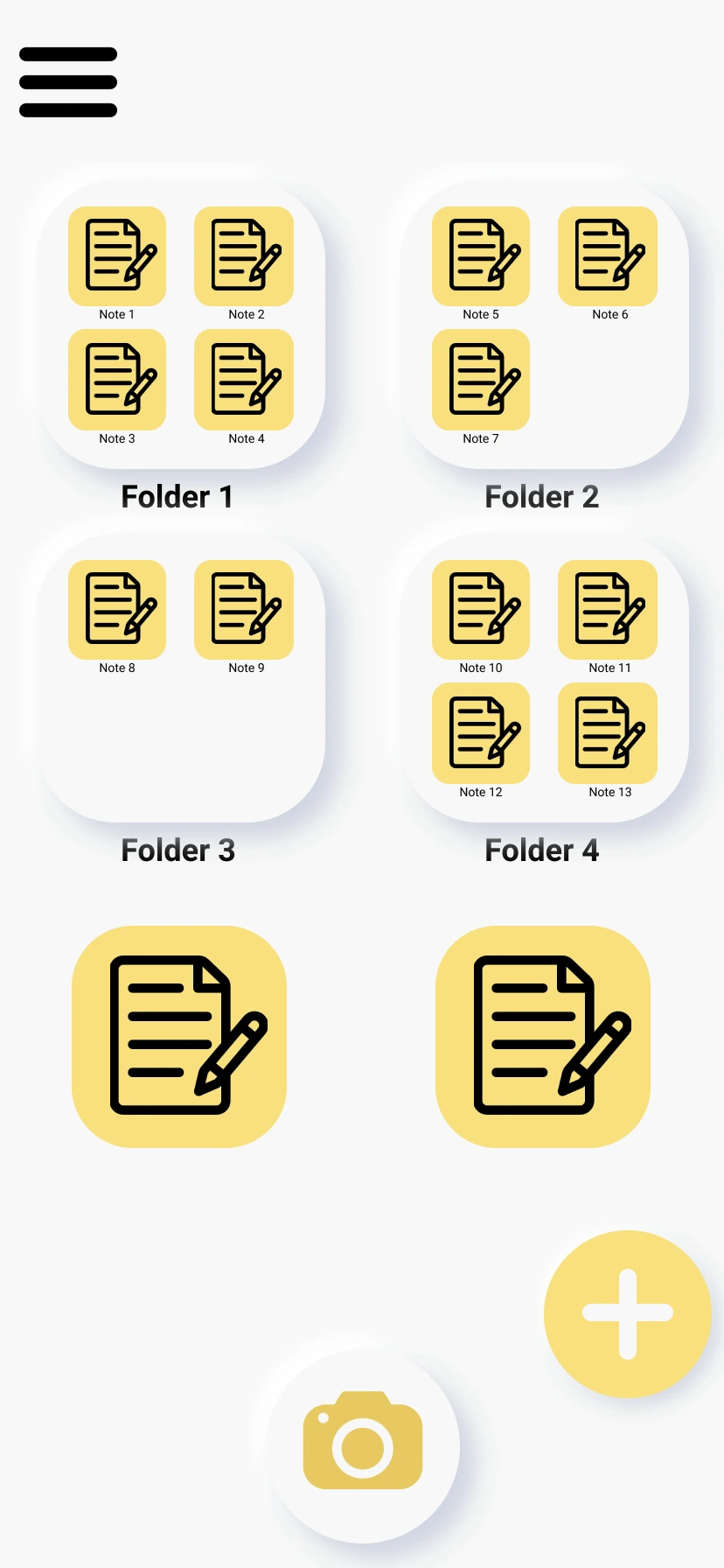
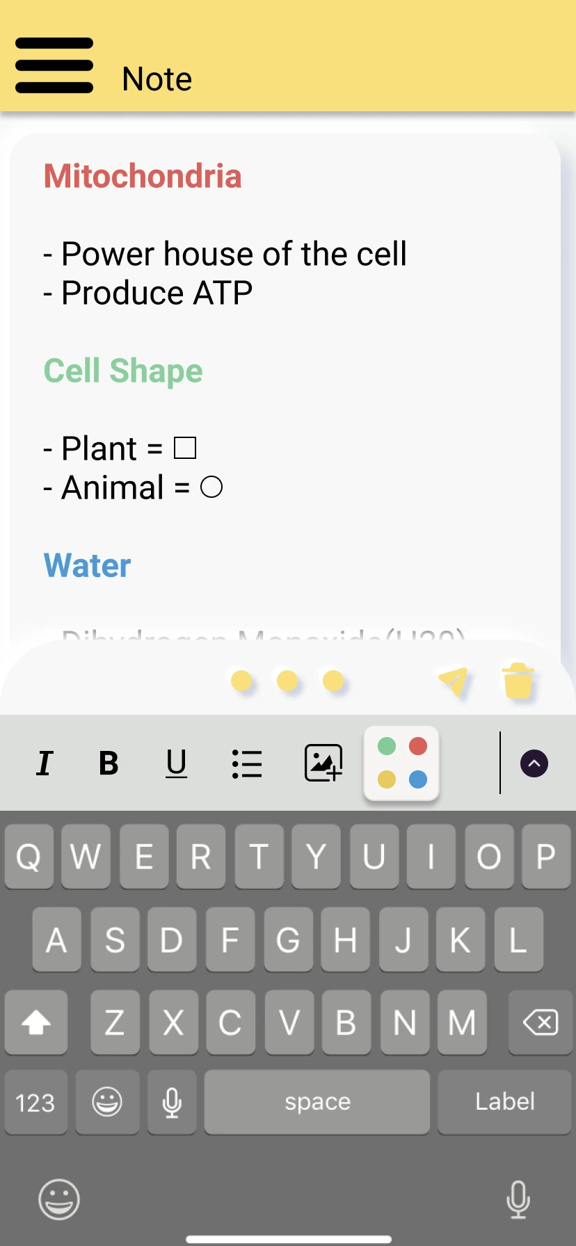
The finished system included a planner, folders, note editor, and camera unified under paper-inspired visual language.
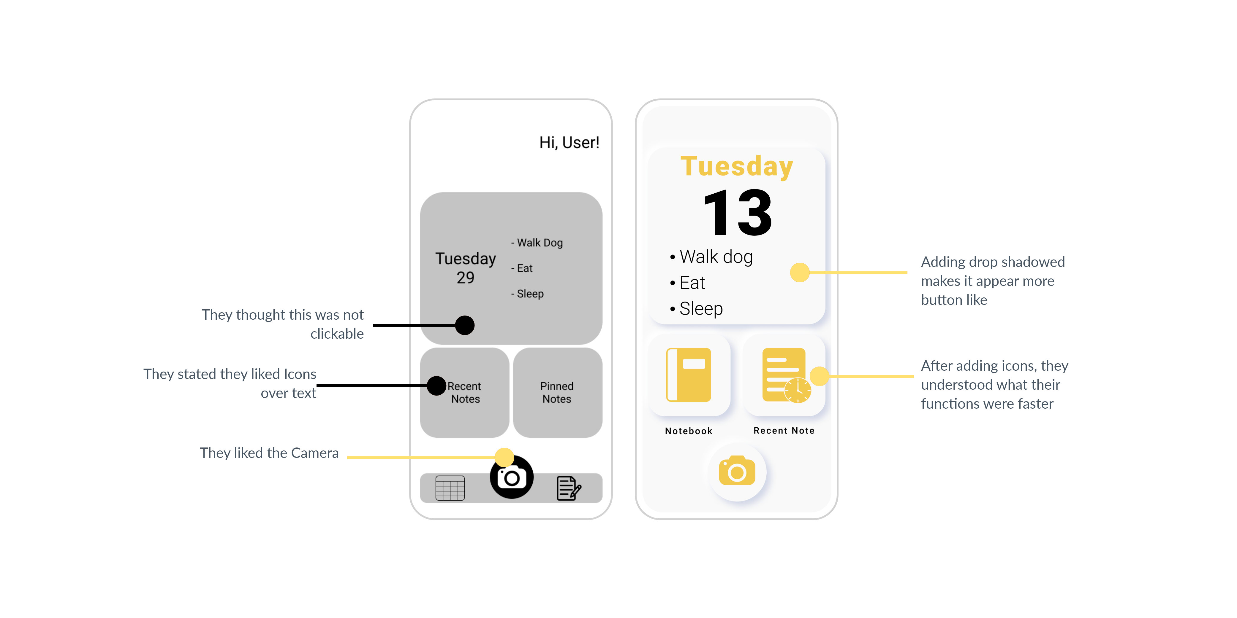
Responding to feedback
The annotated comparison below pairs the early mid-fidelity home screen with the version that landed after the second round of usability testing. Each callout is a specific piece of participant feedback turned into a specific move, such as dropping shadows so tiles read as interactive.
Key screens
Screen 01
Home
The home dashboard surfaces today's date, today's tasks, and the two most common entry points — Notebook and Recent Note — as large tappable tiles. The camera sits as a floating action button, since scanning is the actual entry point.
Cole · quick access
Screen 02
Planner
The planner collapses a monthly calendar into a day-view timeline in one tap. Events are colored blocks anchored to specific hours, borrowing the visual logic of a paper agenda. Cole juggles time across class, work, and life, and the day-view keeps the whole day legible at a glance.
Cole · daily tasks
Screen 03
Folders
The folder viewer addresses Cole's core need: organize an abundance of notes across formats. Users group however folders makes sense to them. The add (+) and scan (camera) actions live together at the bottom to keep functions in the same relative location.
Cole · organize abundance
Screen 04
Note Editor
Color-coded section headings let users build their own information hierarchy as they go, pulling forward the highlighter behavior we observed in interviews. The label key in the formatting toolbar opens a palette of pre-set tags, keeping the visual system consistent across notes.
Cole · color-coding
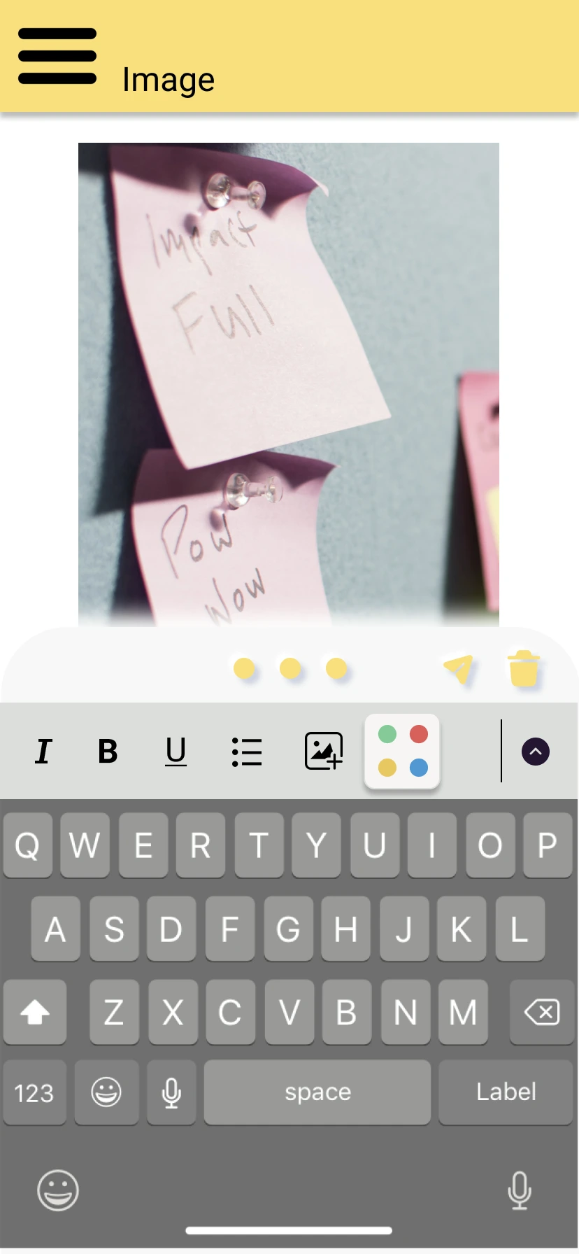
Screen 05
Image Attachment
Photo attachment closes the loop between paper and pixel. A captured image becomes a block inside a note - taggable, deletable, and shareable through the same toolbar as text content.
Closing the loop
Sprint 2
01Assumptions
→
02Design
→
03Build MVP
→
04Research
↺
The final round of interviews tested well — the navigation refactor, the iconographic tiles, and the warm visual language all read as intended. We closed each sprint with a retrospective: what went well, what didn't, and what to carry into the next turn of the loop.
What I'd do differently
The deeper lesson was about why people prefer analog: the project would have stalled if we'd treated paper as a problem to solve rather than a behavior to extend. Lean UX gave us the structure to discover that early, before we'd committed to a direction we'd have had to walk back.
If I ran this again, I'd push harder on accessibility from sprint one — the "diversely-abled" assumption in our backlog stayed under-tested. I'd also pull the personas into more of the day-to-day decisions; we referenced them at kickoffs but didn't always carry them into the screen-level conversations where they would have helped most.